![[WEB/CSS] flexbox](https://img1.daumcdn.net/thumb/R750x0/?scode=mtistory2&fname=https%3A%2F%2Fblog.kakaocdn.net%2Fdn%2Fx8Zqp%2FbtruqFtZlbU%2FoEAdmmltdiSqeljxjkvzqK%2Fimg.png)
flex
: 요소들을 자유자제로 뮈치 시키는 속성
: flexbox는 구현이 어려운 레이아웃을 간단하게 구현할 수 있게 css3에 추가된 레이아웃 방식이다.
: flex-grow, flex-shrink, flex-basis의 축약속성
구성

flexbox는 자식 요소인 flex item과 상위 부모 요소인 flex container로 구성된다.
기본 사용 세팅
flexbox를 만들기 위해서는 부모 요소에 display: flex 속성을 선언하면 된다.
.flex_container {
  display: flex;
}
속성
1) 부모 속성 (container)
flex-direction : flexible item이 flex 컨테이너 안에 위치되는 방법 지정
[속성값 : row, row-reverse, column, column-reverse, initial, inherit]
flex-wrap : 플렉스 박스 아이템을 배치하는 방법 지정/ 즉, item을 wrap 할 것인지 아닌지를 결정
( wrap : 아이템 가로로 배치, 아이템이 다 차면 다음 행으로 아이템 이동)
[속성값 : nowrap, wrap, wrap-reverse, initial, inherit]
gap : flexbox item 사이의 여백을 지정
[속성값 : row, column, initial, inherit]
2) 자식 속성 (item)
flex-grow : flexible item들이 차지할 너비들에 대한 증가형 숫자 지정 (기본값 0)
[속성값 : number, initial, inherit]
flex-shrink : flexible item들이 차지할 너비들에 대한 감소형 숫자 지정 (기본값 1)
[속성값 : number, initial, inherit]
flex-basis : item의 길이 지정 (기본값 auto)
[속성값 : number, auto, initial, inherit]
flexbox 활용 레이아웃 예제
스크롤 없는 100& 레이아웃

.flex_container {
  display: flex;
  flex-direction: column;
  height: 100%;
}

.flex_item {
  flex: 1; /* flex: 1 1 0 */
  overflow: auto;
}
네비게이션 영역

.flex-container {
  display: flex;
}

.flex-item {
  flex: none;
  /* flex: 0 0 auto */
}

.flex-item-gnb {
  margin-left: auto;
}
브라우저 화면 아래에 붙는 푸터

.flex-container {
  display: flex;
  flex-direction: column;
}

.flex_item {
  margin-top: auto;
}
정렬이 다른 메뉴

.flex-container {
  display: flex;
  justify-content: space-between;
}
폼 레이블 수직 중앙 정렬

.flex_container {
  display: flex;
  align-items: center;
}
중앙 정렬 아이콘

.flex_container {
  display: flex;
  align-items: center;
  justify-content: center;
}
.flex_container {
display: flex;
}
.flex_item {
margin: auto;
}유동 너비 박스

.flex_container {
  display: flex;
}

.flex_item {
  /* flex : initial */
  max-width: 300px;
}
말줄임과 아이콘
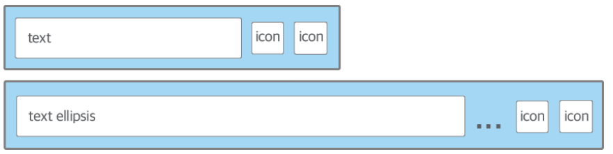
.flex_container {
  display: inline-flex;
  max-width: 100%;
}

.text {
  /*flex: 0 1 auto*/
    overflow: hidden;
    text-overflow: ellipsis;
    white-space: nowrap;
}
위아래로 흐르는 목록

.flex_container {
  display: flex;
  flex-direction: column;
  flex-wrap: wrap;
  justify-content: space-around;
  align-content: space-around;
}
가로세로 비율을 유지하는 반응형 박스

.flex_container {
  display: flex;
  flex-wrap: wrap;
}

.flex_item_list {
  flex-basis: 33.3%;
  display: flex;
  flex-direction: column;
}

.flex_item_image {
  flex: auto;
  /*
  flex-grow: 1;
  flex-shrink: 1;
  flex-basis: auto;
  */
}
오늘의 알아두면 좋을 꿀팁
div.container>div.item.item${$}*10 (Tab 키 누르기)
 <div class="container">
        <div class="item item1">1</div>
        <div class="item item2">2</div>
        <div class="item item3">3</div>
        <div class="item item4">4</div>
        <div class="item item5">5</div>
        <div class="item item6">6</div>
        <div class="item item7">7</div>
        <div class="item item8">8</div>
        <div class="item item9">9</div>
        <div class="item item10">10</div>
      </div>
참고하면 좋을 사이트 & 참고한 영상
심심할때 하면 좋을 게임인것 같다.
Flexbox Froggy
A game for learning CSS flexbox
flexboxfroggy.com
'WEB' 카테고리의 다른 글
| [javascript] 변수 선언(var), 디버깅(console.log) (0) | 2022.03.01 |
|---|---|
| [WEB] html/css 레이아웃 (0) | 2022.02.28 |
| [WEB] CSS 기본실습(2) (flex, gird 레이아웃) (0) | 2022.02.27 |
| [WEB] CSS 기본실습(2) (0) | 2022.02.26 |
| [WEB] CSS 기본실습 (0) | 2022.02.25 |